Redesign Healthcare Website
Victoria Angel was designed to collect stem cells for those in need of stem cell transplants. However lately conversion rates between website visitors and donors have been low.
The Problem
We re-designed the website to be able to increase conversion rates and therefore create more donations.
Solution
Figma, Kanban, Illustrator, Miro
Tools Used
UX Design and Research, UI Design
The Role
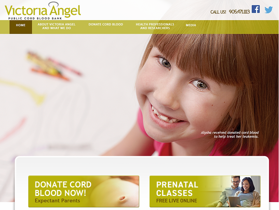
Current Website
Users complained Confusing Primary Navigation, Lack of relevant Hero Image, Non User friendly typography & Fonts, and Not suitable Colour scheme and images
Research Goal
Find out why people are not encourage to use the online features of the website?
What is motivating them to register in person rather than online?
Is the Website Navigation too confusing?
Can they not find the Registration Form on the website?
Why are user not donating over the website?
Interview Results
All User had difficulty in finding the Registration Form. They complained the navigation was confusing and the website seemed fake. Common issues were links and buttons were not working.

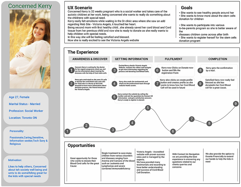
ProtoPersona
Kerry is a passionate 27 years old Social Worker, who wants to donate her Cord Blood Sample to a Public Bank so that it can be used to save anyone's life. This is her first pregnancy and she wants to have more information of the program before she registers for it, but the current website is not providing her the information she is looking for.
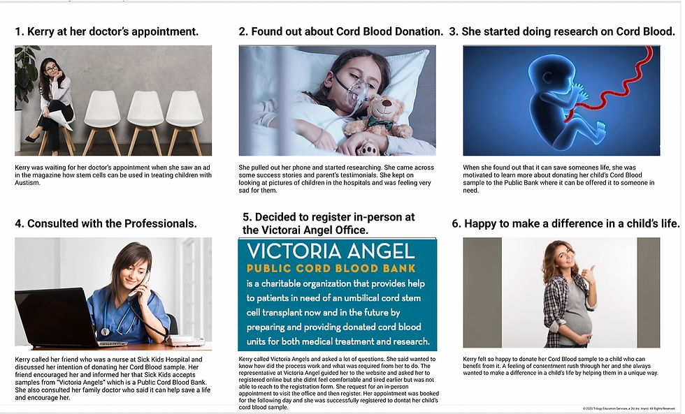
Storyboard for Current Website
We had to create two storyboards to show how the entire cycle of registration changes with the new concept. Here it shows how the customer first took information over the phone, then visited the website since the website was so confusing she had to sign up in person.
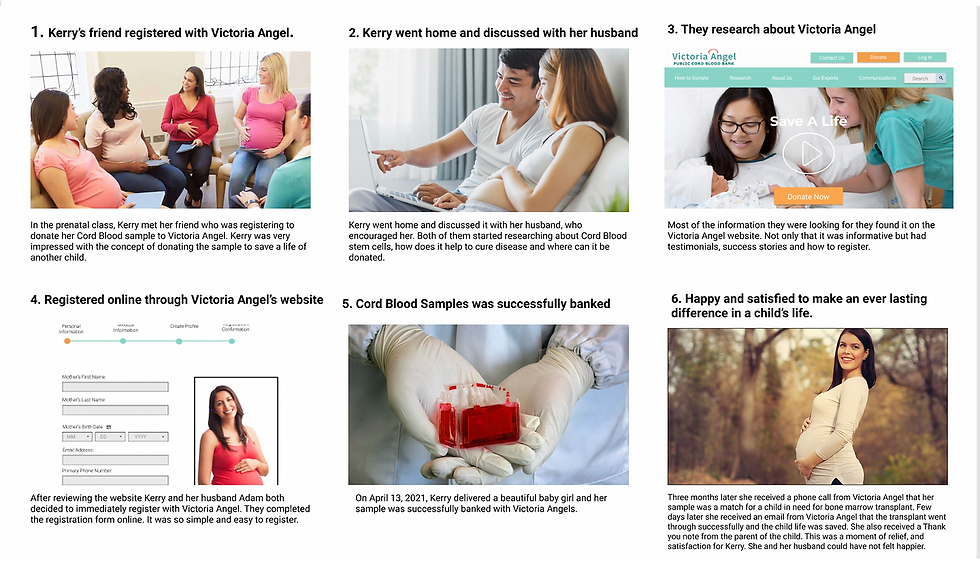
Storyboard of Iterated Website
In this scenario, the customer found out from friends about the Cord Blood donation, she visited the website with her husband. Since the new website had all the information she was looking for she was easily able to register online.
User Journey
After talking to several people during the interview, I developed Kerry, my main persona. Kerry is married and is expecting her first child. She has decided that she wants to donate her child's Cord Blood sample to someone in need. She wants to register online and doesn't want to go in person to register.
In the interview session, we touched on the pain points of the users. We listed all the issues they were facing on the existing website.
Interview Results
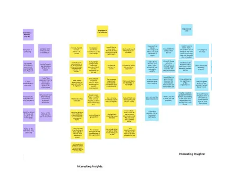
We organized all the customer feedback in different categories, and mapped out the main target points to improve the overall performance of the website
Affinity Map

Then we further filtered the categories to get a deeper understanding of the main issues to address.
Empathy Map

Usability Testing
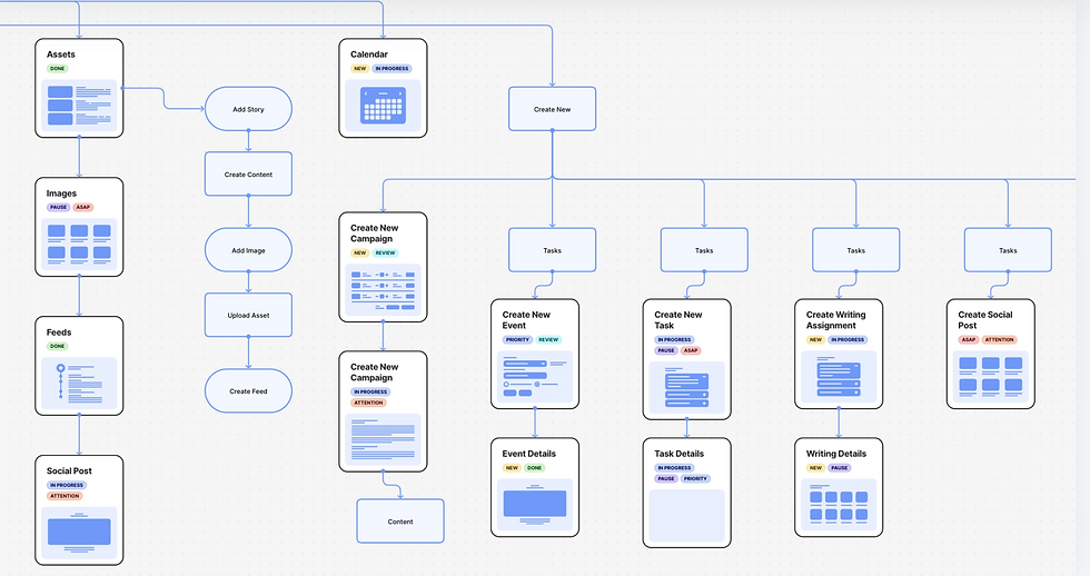
User Flow
Based on the previous task flow and what we know about their habits, this user flow walks through the customer's journey through the site, taking into account various decision points along the way.
Responsive Wireframes
After reviewing the sketches with the client and a couple of iterations, it’s time to start refining in the form of a low fidelity wireframe. Here, I further identified the layout of the interface. Utilizing wireframes in the beginning phases of design, is an efficient way to communicate placement of elements without getting too bogged down in minute details. A huge benefit and timesaver is that the layout can easily be changed.

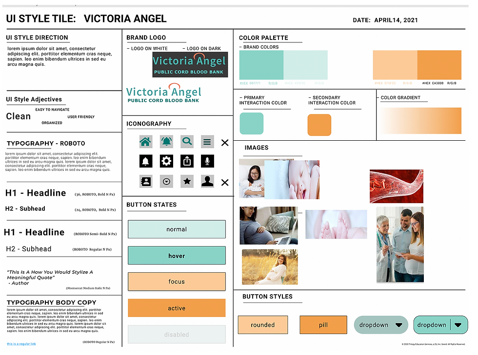
Style Guide
This is where Kerry's branding really starts to take shape. By using the mood board elements as inspiration we came up with the resulting style tile you see here. The client was presented with a choice of color palettes and she chose the one pictured. This gives us an idea of how the site could look by listing out all the different variations in logo styles, colors, and photo usage. The style tile helps set the mood and tone of the brand and is used in the next step. View the full size style tile.
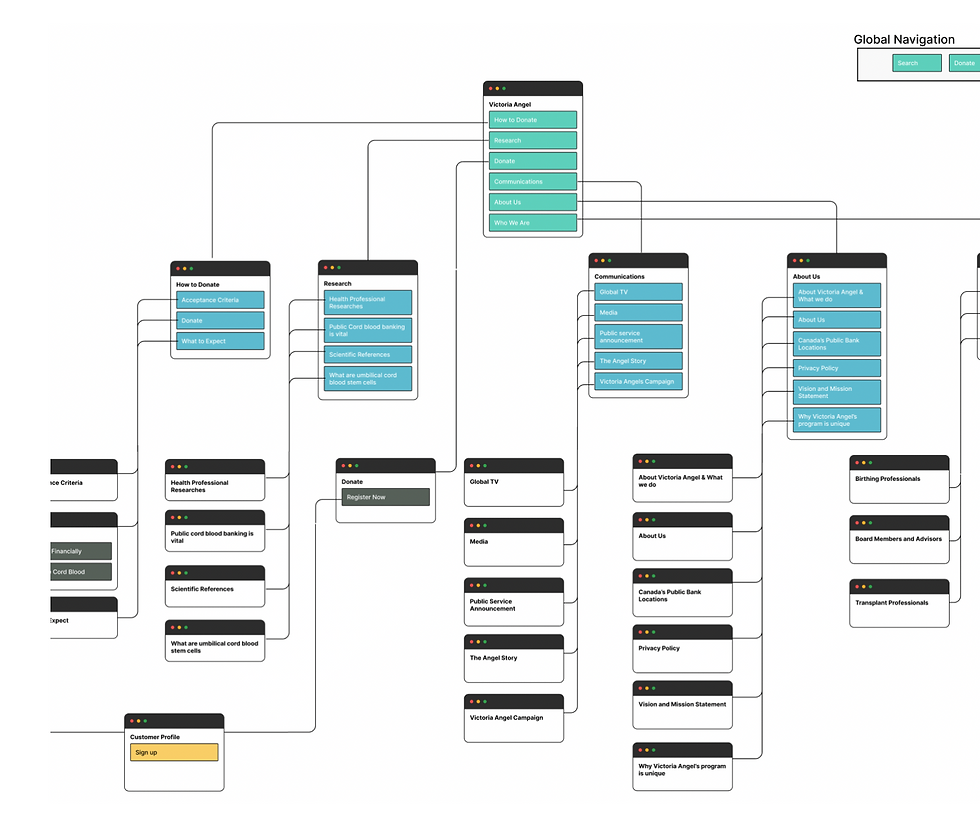
Sitemap
Redesigning an existing website gives us the "advantage" of having an information architecture (IA) already in place. The client and I discussed the structure of the site ahead of time. I had every intention of speaking with her clients about the use of the site to get more insight into the architecture, but she was reluctant to give out their information to me. If I had had that research and also usage statistics, information architecture might have turned out differently.

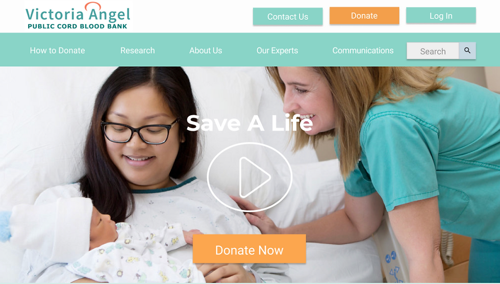
Updated Website
We introduced a quick information video on the homepage to inform the customers of the process and answered most of the FAQs. Updated Navigation Bar with a separate Registration Page, which included a fillable Registration form which made sign up easy.
Iterated Mobile Design
After the website, we then introduced easy sign-up through the app as well. This helped the company to sign up people on the spot.

Final Thought
To confirm if the website iteration were effective, the Marketing team performed a test on 50 new users and discovered that the majority of the user was able to easily register online. The result was 87% more than their existing website. The Redesign was approved by the CEO and it is now in the development phase.

Launched New Forms
Condensed the length of the form, added bread crumbs so that the user can evaluated how far they are from the finish line. This strategy motivated the user to use the form with confidence and efficiently.